Tuesday, March 29, 2011

Social Science

This Wednesday, March 30 from 7-11 pm is the Science Museum of Minnesota's first Social Science Event. It is an after hours, 21+ event with cash bars, food, music and science related entertainment. I'm especially looking forward to the animals the Minnesota Herpetological Society will have on view, like an alligator and TWO types of Sand Boas. More details about the event here.

I entered a competition to design the identity for this event, and happily my design was chosen. Here is some of my process, and the final designs.

I started sketching with the events features in mind: drink, food, fun, and science.
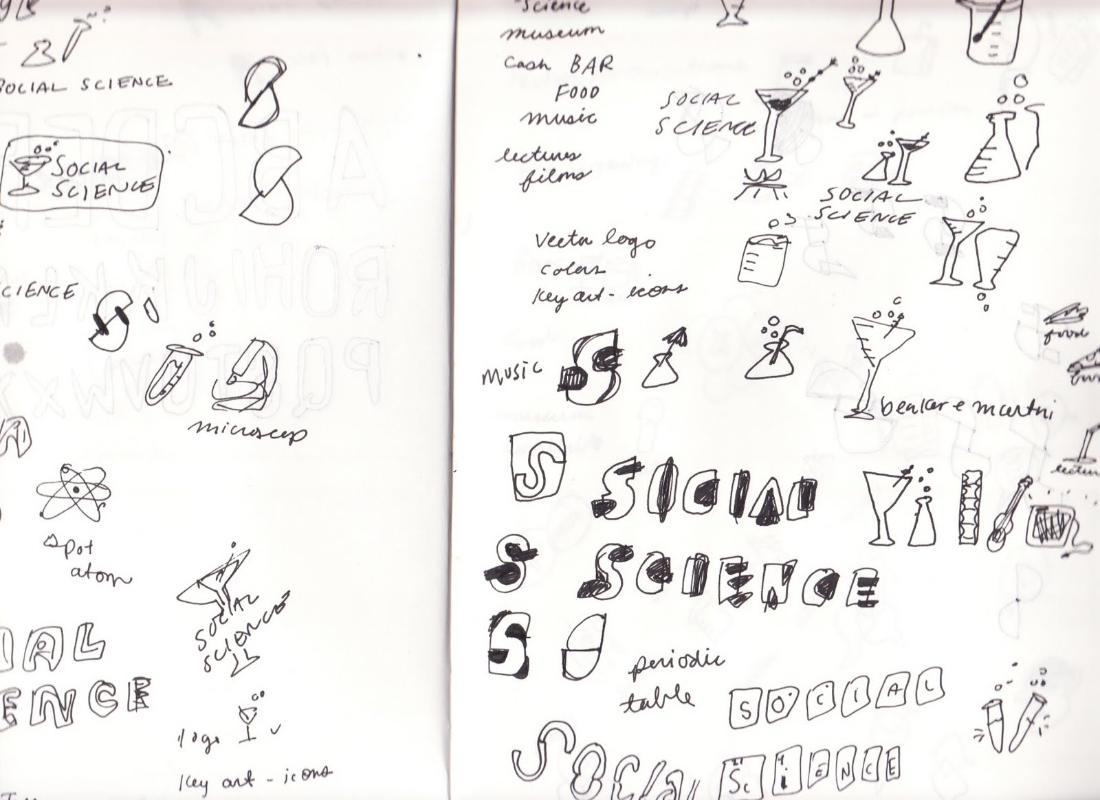
I decided to combine a beaker and a martini glass to pair the social and the science.
I tried two different directions for type. One inspired by the periodic table of elements (early process above.)
And the second, a hand draw playful treatment to express the youthfulness of the event.
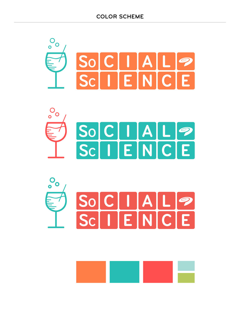
After some feedback from the Science Museum staff, I created a wine and beer glass version of the logo, since that is what will actually be served at the event.
And here is the final mark! I refined the periodic table type treatment and incorporated the Science Museum's 'swirl' logo. Below is my suggested color scheme, the key art/icons I created, and some logo variations. Thank you to everyone at the Science Museum, this project was a blast to work on and I'm looking forward to all the Social Science events coming up!


Tuesday, March 22, 2011

Twin Peaks Illustration + Process


(Audrey Horne's saddle shoes)

A while ago I watched the Twin Peaks series in its entirety, in about a month period. I had only seen a few episodes here and there before, and never really got the mania about it. Once I watched it all in order I was hooked. I noticed so many symbols, like chess pieces and lockets, I thought it might lend itself to a good illustration. I started with image research, and making a list of about 20 items I thought summed up the important plot points and main characters of the two seasons.
(Dr. Jacoby and his freaky glasses)

(Hank and his domino)

(One Eyed Jacks casino chip)

I did ink drawings of all the symbols in my sketch book.
I scanned in the drawings and started coloring them digitally. Originally I thought the composition would be based off the "Welcome to Twin Peaks" sign. However, I mocked it up and didn't think it filled out the space very well.
So then I though I would have the composition be like a spread from Laura Palmer's diary, with these symbols and notes in it. I liked the composition, but not this weird 3-d diary style I tried.
I stepped back a bit, and re-colored each element, since I wasn't so happy with that either. Here is Laura's cousin Maddy Ferguson, with the new color treatment.
I tried the diary format again, but this time a little more laid back.


(Click to enlarge)

This is the final! The process for this illustration was a lot more time consuming than normal, but I was trying out some new coloring and texture techniques, so it's ok. I am happy with the final, and happy to be done with this and move on to other projects. Below are some detail shots.


Tuesday, March 15, 2011

Brief Apartment Tour

Traditionally I do a room tour any time I inhabit new living quarters. I haven't done one for my new Minneapolis home yet because I am still unpacking and organizing, but here are a few images.


My first before-and-after/DIY/design sponge/apartment therapy-esque project. Last night I was staring at our record cabinet and I thought of a use for some nice old wallpaper I've had forever. I whipped up some wheat paste and applied the wallpaper to the two sliding front panels. (You can tell the before shot by the bad lighting and poor picture quality.)
My grandpa made this bookshelf for me and I used it throughout my childhood. It has been in my parent's garage since, and I am happy to have space and a use for it again.

And this is what's on my drawing table! I've set a goal of blogging once a week, so check back soon.