Saturday, December 31, 2011

ROOKIE MAG

The end of December marks the end of my first month as a regular illustrator for ROOKIE MAG. If you don't know, ROOKIE MAG is the best website ever for teenage girls.

Illustration for the short story: The Surge We Need, by Maggie Thrash.

Illustration for the article: Pop Culture Comfort Food, by Sady Doyle.

This was an illustration for an article about SAD (seasonal affective disorder), that went unused, but I wanted to share anyway.

Sunday, December 11, 2011

A sketch, Lydia Davis, and Rodarte

Long time, no blog! I do have some recent drawings to share. First, a spread from my sketchbook-portraits using brush and ink.


I've been reading The Collected Stories of Lydia Davis which has stories ranging from two sentences to 20+ pages. While reading I kept flipping to the back cover and looking at the author portrait, which features Davis with a cat in front of some ivy. After some image research, I found most of her portraits include cats. Below is my portrait of Davis.


I decided to do a portrait of the designers behind the fashion label Rodarte, sisters Kate and Laura Mulleavy. I recently watched a lecture they gave at the Hammer Museum about their new book, a collaboration with photographers Alec Soth and Catherine Opie. They talked a lot about growing up in Northern California and what an influence their environment was. I included these references in my portrait: the redwoods, the Santa Cruz Beach Boardwalk (roller coaster), the Hubble Space Telescope, and the palm trees of Southern California (where they live now.) Little known fact: Kate and Laura grew up in the small town of Aptos, in Santa Cruz county-the same small town that I grew up in! I found this out after following and enjoying their work for some time.

Friday, September 16, 2011

Cleaning off the desktop


A sampling of 6 out of the hundreds of images on my desktop. I think these all share a similar feel.


Keith Davis Young Crop of album art for the band Blue Kabuki

Paper Rad "Untitled (Homer Simpson)"
I haven't thought about Paper Rad in years, and then this fine piece of work popped up.

Found this cell phone pic floating around the net. I saw it before I went to the Minnesota State Fiar, and wanted to see it IRL, but couldn't find it. A lot of the sinage inside the buildings are made out of this great 3D glitter type.

Drawing by Minna Gilligan. Discovered her through the new Rookie Mag, where she has illustrations accompanying posts. View more drawings on her

Shuli Sadé "Regrown
This piece is a lot different than the rest of Sadé's work which ranges from architectural photography to paintings.


Love this series of advertisements that were published in Vita.Mn for the Lake Harriet Movies and Music series. Can't find a credit, but I am 99% they were made by Dan Black, of Land Land.

Thursday, September 8, 2011

Photo Booth Diary #5

It's been too long! How about an update in my Photo Booth Diary series? Here's how I described this back in 2009 when I posted my first one "...I hope others will share their own. I pulled 16 Photobooth pics, that are self portraits, and made a 4x4 contact sheet. They are better if you don't edit out the embarrassing ones."

Sunday, July 10, 2011

2 new paintings


2 new paintings on small wood squares. Trying to do a little painting at night to offset all the design projects I'm working on. The face on salmon colored background is on a piece of dried PVA glue. This material presented some problems, as it was turning back into liquid glue as I painted on it!

Tuesday, March 29, 2011

Social Science

This Wednesday, March 30 from 7-11 pm is the Science Museum of Minnesota's first Social Science Event. It is an after hours, 21+ event with cash bars, food, music and science related entertainment. I'm especially looking forward to the animals the Minnesota Herpetological Society will have on view, like an alligator and TWO types of Sand Boas. More details about the event here.

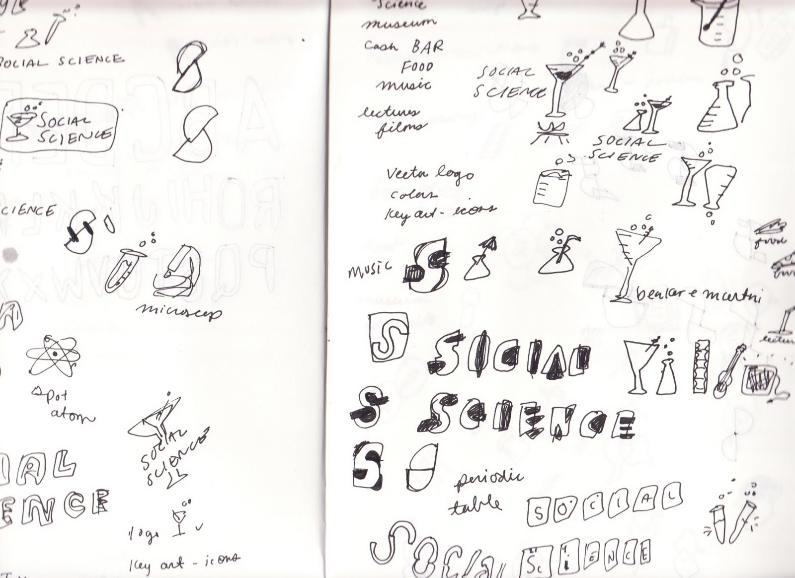
I entered a competition to design the identity for this event, and happily my design was chosen. Here is some of my process, and the final designs.

I started sketching with the events features in mind: drink, food, fun, and science.
I decided to combine a beaker and a martini glass to pair the social and the science.
I tried two different directions for type. One inspired by the periodic table of elements (early process above.)
And the second, a hand draw playful treatment to express the youthfulness of the event.
After some feedback from the Science Museum staff, I created a wine and beer glass version of the logo, since that is what will actually be served at the event.
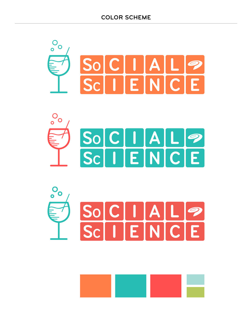
And here is the final mark! I refined the periodic table type treatment and incorporated the Science Museum's 'swirl' logo. Below is my suggested color scheme, the key art/icons I created, and some logo variations. Thank you to everyone at the Science Museum, this project was a blast to work on and I'm looking forward to all the Social Science events coming up!


Tuesday, March 22, 2011

Twin Peaks Illustration + Process


(Audrey Horne's saddle shoes)

A while ago I watched the Twin Peaks series in its entirety, in about a month period. I had only seen a few episodes here and there before, and never really got the mania about it. Once I watched it all in order I was hooked. I noticed so many symbols, like chess pieces and lockets, I thought it might lend itself to a good illustration. I started with image research, and making a list of about 20 items I thought summed up the important plot points and main characters of the two seasons.
(Dr. Jacoby and his freaky glasses)

(Hank and his domino)

(One Eyed Jacks casino chip)

I did ink drawings of all the symbols in my sketch book.
I scanned in the drawings and started coloring them digitally. Originally I thought the composition would be based off the "Welcome to Twin Peaks" sign. However, I mocked it up and didn't think it filled out the space very well.
So then I though I would have the composition be like a spread from Laura Palmer's diary, with these symbols and notes in it. I liked the composition, but not this weird 3-d diary style I tried.
I stepped back a bit, and re-colored each element, since I wasn't so happy with that either. Here is Laura's cousin Maddy Ferguson, with the new color treatment.
I tried the diary format again, but this time a little more laid back.


(Click to enlarge)

This is the final! The process for this illustration was a lot more time consuming than normal, but I was trying out some new coloring and texture techniques, so it's ok. I am happy with the final, and happy to be done with this and move on to other projects. Below are some detail shots.


Tuesday, March 15, 2011

Brief Apartment Tour

Traditionally I do a room tour any time I inhabit new living quarters. I haven't done one for my new Minneapolis home yet because I am still unpacking and organizing, but here are a few images.


My first before-and-after/DIY/design sponge/apartment therapy-esque project. Last night I was staring at our record cabinet and I thought of a use for some nice old wallpaper I've had forever. I whipped up some wheat paste and applied the wallpaper to the two sliding front panels. (You can tell the before shot by the bad lighting and poor picture quality.)
My grandpa made this bookshelf for me and I used it throughout my childhood. It has been in my parent's garage since, and I am happy to have space and a use for it again.

And this is what's on my drawing table! I've set a goal of blogging once a week, so check back soon.

Sunday, January 9, 2011

Girls / Women Publication

I'm pleased to be posting about a new publication I made with Jordan Kay, called Girls (or) Women, depending on how you look at it. You can see more of it on my website, purchase it in my shop, or in Jordan's shop. It feels good to get more printed matter into the world. I had fun designing the format, which has two front covers, liner pages, cut-out dust jacket flaps, sewn binding, lots of different paper stocks/colors, and a fold-out poster! It nearly killed me producing an edition of 50 during my last week in San Francisco, but I'm very happy I did.